Monday, January 11, 2010
Monday, August 08, 2005
Starry Eye Surprise
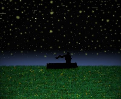
wishing
Sketch '05
~~>my first real attempt at photoshop, as you can see the stuff i used are pretty basic. i've "dabbled" with it occasionally but never really bothered with it but since i'll be trying to get into graphic design as a career.
anyone who knows photoshop can obviously see what i used but for any of those who have no idea here's the head's up; i used the brush tools' grass, leaf, fuzzy for the stars and charcoal (i think) to make the stars run across the sky. i also used the gradient tool; green to black on the grass (can't really see it huh?) then overlapped it with blue to black (that's why!). used a lens flare...or was it spotlight, maybe it was spotlight to make it seem like you're really there staring at it, giving a cone of vision type of sense to it. as for the person and log i actually drew those then scanned in, cropped it and pasted it, then darkened it to make a silhoutte look of it. wanted to highlight the top of the head and shoulder and the top of the log, to separate the night sky from the guy's head, i know i'll make some more adjustments to it and hopefully get it done before school starts again.
a friend of mine knows the meaning but hopefully he won't say anything to anyone if pressed upon this matter (right buddy? ;) ) and another person knows, hopefully....
i'll try and do another piece as well using photoshop before school starts, really need to get the hang of it for next semester, i'm sure of it. keep you all updated.
Saturday, July 09, 2005
1st Hired Work!
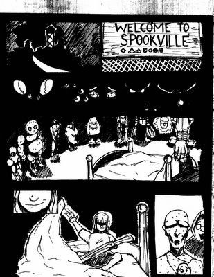
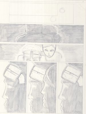
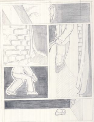
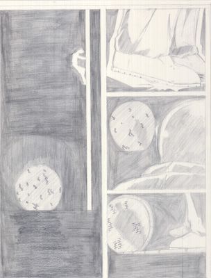
spookville pg.1
~~>i guess i can say this is my first real work or my first break into the comic biz, even though i'll never know whether or not this piece will ever get published but still my first break into the the comic industry (thanx bryan fischer, think that's how his name's spelled?!).
my job was to draw the first page (i'm assuming its the first page) of an anthology, which involves monsters...and well, monsters aren't my specialty but i intend to work on that area some more.
give me some feedbacks as to what you guys (and gals) think of it. every kind of criticism will be considered (maybe...).
--holden
Tuesday, February 01, 2005
"...good, good.... You Knee?"
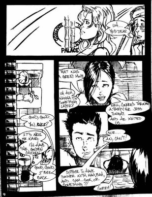
AAS pg.1

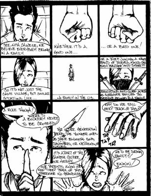
~~> this was a project i did for my asian american studies class, to get out of doing a book report which turned out to be both good and bad. anyways, basically the story talks about chinese kinship; aunts, uncles, nephews and etc. but not by blood. yeah chinese people are weird like that anyways basically the guy is telling his girlfriend what he knows about this kinship thing within the chinese culture. and there's a twist at the end of the story...well, depending on how you look at it.
basically this chinese idea of kinship came into play when many chinese men began coming over to the U.S. a long time ago. many of these men came from the same province or village and since they had no family they relied on one another, you know back-up and/or support one another in times of need. coming to the point of addressing one another as 'brother'--so-and-so. when women were allowed to come over (finally!) the women would treat their husbands' 'brothers' literally as blood family and this carried on through to the childrens teaching them that 'oh so and so is your third uncle and so and so is your 18th auntie' and other b.s.. this of course is carried on to the present generation where people who we call 5th uncle actually has no blood relation to any of us which many of us in this generation see this as being pointless because then by now every chinese in any part of the U.S. is related to another which means family members are marrying another. remember even though they're not related, they treat one another as blood-related so...!
i really messed up with this, looking back at it now, like i shouldn't have hand-drawn the word balloons or hand-written the text as well but then i didn't have any software for the word balloons plus it was close to the due date when i finally finalized the idea of the story. but the point of this is show my inking skills, which isn't all that well but it'll have to do. if any employers wanna hire me then you have to look over this and then make your decision. i'm a penciller who'll ink over his work but i am not an inker period. i have a bit of confidence in my inking ability but not an arrognant a-hole that "yeah! i'm a pro!" so not me. so there.
--holden
p.s.--this was done back in '03 or maybe '02 so these are actually old. i'm still progressing in my penciling abilities; again not an arrognant a-hole that "yes! i'm a pro penciller!" cuz i'm not, i'm still learning...later nitez.
Sunday, January 30, 2005
Saturday, January 29, 2005
Ultimates #1
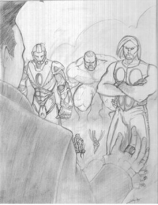
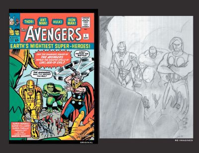
re-imagined Avengers #1

~~>i've become a big fan of the whole re-drawn covers meaning amazing fantasy number three hundred something, the introduction of spider-man, with the cover redone by alex ross or the issue of the fantastic four (or was it a spider-man comic?) where spidey's on the cover trying to get into the baxter building re-drawn by humberto ramos and others.
after seeing contemporary artists tackle those classic covers i just loved that idea of re-drawing those covers with the modern look.
so i decided to test myself by taking the classic avengers #1 (vol. 1) cover and basically used my style as well as the ultimates to re-do the cover. as you can see its in pencil, i'm still deciding whether or not to go over it with ink and color.
now, here we go. for loki i actually went with the alan cumming's look of loki for the upcoming movie "son of the mask" because there's no way in hell that you'll find a green and gold loki walking around up in mark millar and bryan hitch's the ultimates, i tried my best to get the look of alan cumming even though its a 3/4 angle of him. tried my best.
you're all wondering now why is hulk and ant-man up in the same time well like i said i wanted it to be literally a redo of avengers #1 (vol. 1)'s cover so i twisted this in my favor. i tried my best to keep ant-man and wasp as small as possible because...well, hitch would do have it the same way simple as that. iron man took me the longest, even though it may not seem like it, i tried my best to put in as much detail as possible on his armor.
i have an image of the the avengers #1 but its too small so i'll be looking around so that i can have a compare and contrast of that cover with this one, similarities and differences for all you nit-pickers out there.
next up will be...avengers #4 cover, the with "captain america lives again!". so check on this periodically to see where i'm at.
--holden

